For its 2018 Neighborhood Housing Index, ATTOM Data Solutions analyzed potential home flipping returns in 3,573 neighborhoods with sufficient home flipping data.
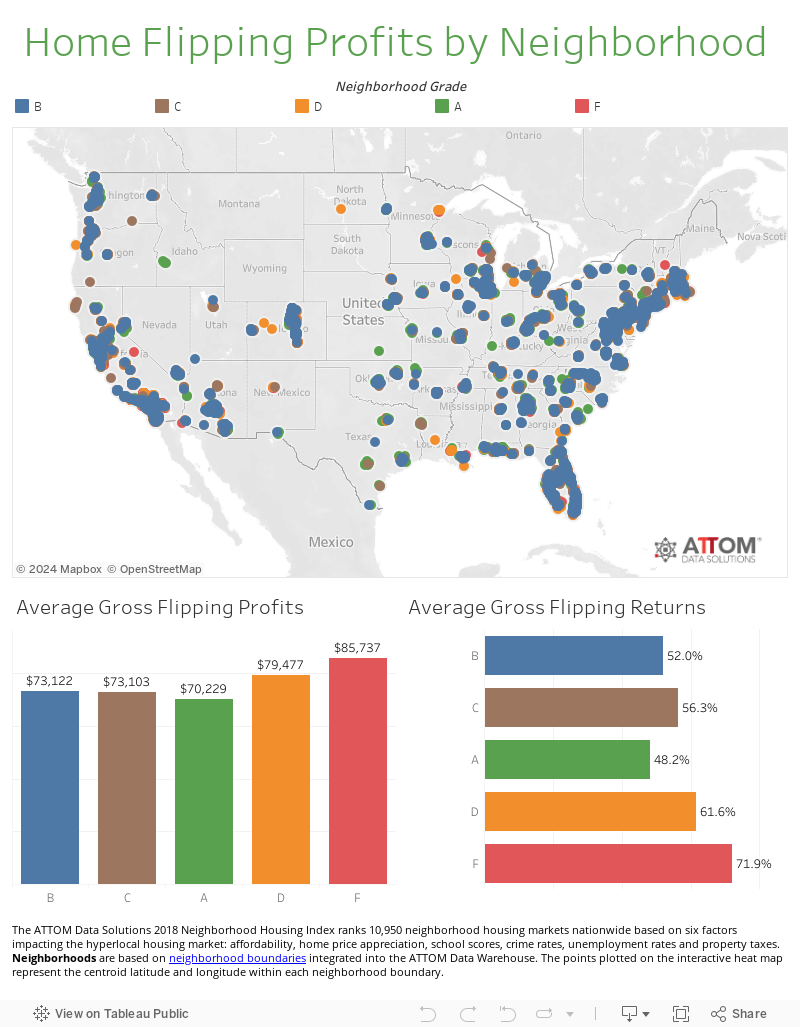
Overall, the best neighborhoods for potential home flipping returns were those with an F rating, followed by D, C and B rated neighborhoods. Neighborhoods with an A rating offered the lowest potential home flipping returns.
However, there were 209 neighborhoods with an A rating and with an average gross flipping return on investment of 50 percent or more, led by the Cottage Grove Heights neighborhood in the Chicago, Illinois, metro (309.2 percent ROI); the Woodmere and Dolfield neighborhoods in the Baltimore, Maryland, metro (both with 250.0 percent ROI); the West Chesterfield neighborhood in the Chicago metro (247.8 percent ROI); and the Westside neighborhood in the Memphis, Tennessee metro (221.9 percent ROI).
More neighborhood rankings
2018 Neighborhood Housing Index
Best neighborhoods for buying rental homes
Neighborhood Index Methodology
The ATTOM Data Solutions 2018 Neighborhood Housing Index ranked 10,950 neighborhood housing markets nationwide based on six factors: affordability, home price appreciation, school scores, crime rates, unemployment rates and property taxes.
Neighborhoods are based on neighborhood boundaries integrated into the ATTOM Data Warehouse. The points plotted on the interactive heat map represent the centroid latitude and longitude within each neighborhood boundary.
Affordability is based on the home price-to-income ratio for each neighborhood using median home prices for the first half of 2018 from the ATTOM Data Warehouse and the 2017 median household income from the U.S. Census Bureau.
Home price appreciation is based on the median home price for the first half of 2018 compared to the median home price in the first half of 2017 for each neighborhood.
School scores represent the average school scores for all schools located within each neighborhood. The rating is based purely on the test score performance of each school. Scores are on a scale of 0 to 5, 5 being best.
Crime rates are based on a score that represents the combined risks of rape, murder, assault, robbery, burglary, larceny and vehicle theft compared to the national average of 100. A score of 200 indicates twice the national average total crime risk, while 50 indicates half the national risk. The different types of crime are given equal weight in this score.
Unemployment rates were calculated for each neighborhood using the total number of people employed and dividing that by the total population age 18 to 65 based on 2017 U.S. Census data.
Property taxes were calculated using county tax assessor data from the ATTOM Data Warehouse, and the average property tax rate for each neighborhood was the average property tax bill divided by the median home sales price in the first half of 2018.