For its 2018 Neighborhood Housing Index, ATTOM Data Solutions analyzed potential rental returns for homes purchased as rentals in 10,895 neighborhoods with sufficient rental return data.
While the best neighborhoods for rental returns tended be in neighborhoods with an F, D or C rating, there was no shortage of exceptions with higher-rated neighborhoods yielding good gross annual rental yields — the annualized income from rent divided by the median price of homes sold in that neighborhood in the first half of 2018.
5 Best Neighborhoods for Rental Returns
Among 2,188 neighborhoods with an A rating, there were 494 with a potential annual gross rental yield of at least 10 percent, led by the Westover neighborhood in Fayetteville, North Carolina (41.7 percent potential gross annual rental yield); the Terminal Park neighborhood in Sarasota, Florida (41.5 percent); the Southwest York neighborhood in York, Pennsylvania (35.8 percent); the Griffin Park neighborhood in Tampa-St. Petersburg, Florida (35.8 percent); and the Portland neighborhood in Louisville, Kentucky (33.6 percent).
5 Best Neighborhoods for Neighborhood Quality
Among 494 neighborhoods with an A rating and potential annual gross rental yields of at least 10 percent, those with the highest neighborhood ranking were Hunters Hill in Englewood, Colorado (11.6 percent potential gross annual rental yield); the Providence neighborhood in Elgin, Illinois (11.3 percent); the Winds West neighborhood in Oklahoma City, Oklahoma (15.6 percent); the Devonshire neighborhood in Mobile, Alabama (18.8 percent); and the Park Central neighborhood in Orlando, Florida (19.1 percent).
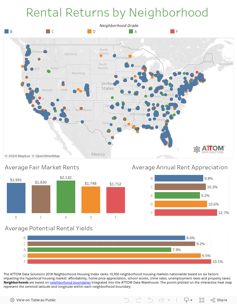
See where any of the 10,895 neighborhoods rank using the interactive heat map below.
More neighborhood rankings
2018 Neighborhood Housing Index
Best neighborhoods for flipping homes
Neighborhood Index Methodology
The ATTOM Data Solutions 2018 Neighborhood Housing Index ranked 10,950 neighborhood housing markets nationwide based on six factors: affordability, home price appreciation, school scores, crime rates, unemployment rates and property taxes.
Neighborhoods are based on neighborhood boundaries integrated into the ATTOM Data Warehouse. The points plotted on the interactive heat map represent the centroid latitude and longitude within each neighborhood boundary.
Affordability is based on the home price-to-income ratio for each neighborhood using median home prices for the first half of 2018 from the ATTOM Data Warehouse and the 2017 median household income from the U.S. Census Bureau.
Home price appreciation is based on the median home price for the first half of 2018 compared to the median home price in the first half of 2017 for each neighborhood.
School scores represent the average school scores for all schools located within each neighborhood. The rating is based purely on the test score performance of each school. Scores are on a scale of 0 to 5, 5 being best.
Crime rates are based on a score that represents the combined risks of rape, murder, assault, robbery, burglary, larceny and vehicle theft compared to the national average of 100. A score of 200 indicates twice the national average total crime risk, while 50 indicates half the national risk. The different types of crime are given equal weight in this score.
Unemployment rates were calculated for each neighborhood using the total number of people employed and dividing that by the total population age 18 to 65 based on 2017 U.S. Census data.
Property taxes were calculated using county tax assessor data from the ATTOM Data Warehouse, and the average property tax rate for each neighborhood was the average property tax bill divided by the median home sales price in the first half of 2018.